Tax Platform UX · EY India

Redesigning compliance,
at national scale.

— Client
EY India
— Practice
Design + Engineering
— Sector
Tax · Compliance
— Engagement
Embedded partner
01 / Introduction

EY's tax platform is one of the most-used pieces of compliance software in India. Some of the country's largest enterprises file their direct and indirect tax obligations through it. The platform had grown capability by capability, team by team, across nearly a decade.

Each module worked. Together, they made the user feel like they were operating four products at once. We were asked to fix that. The brief was simple. Make it feel like one thing.

02 / The brief
i. What we were asked

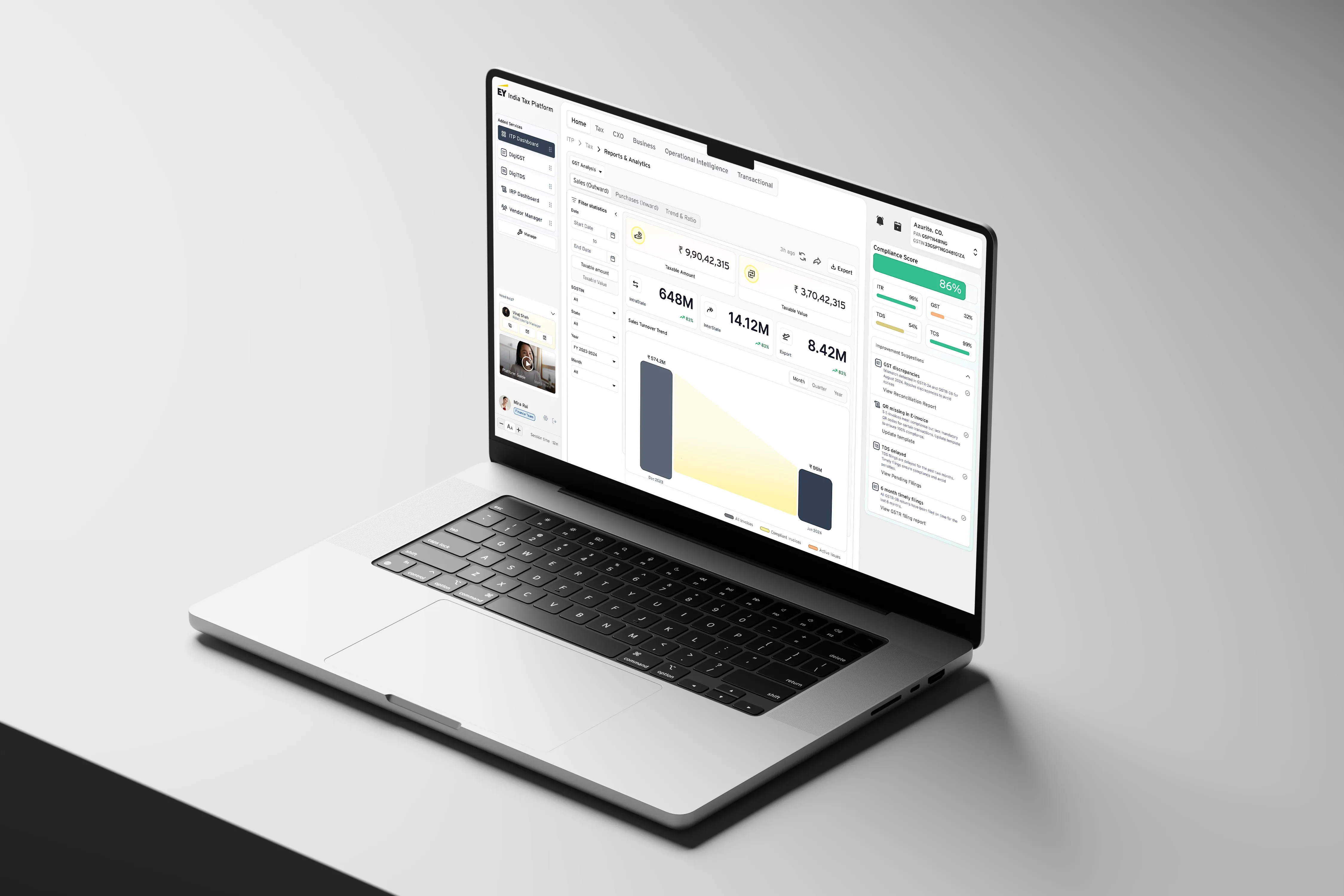
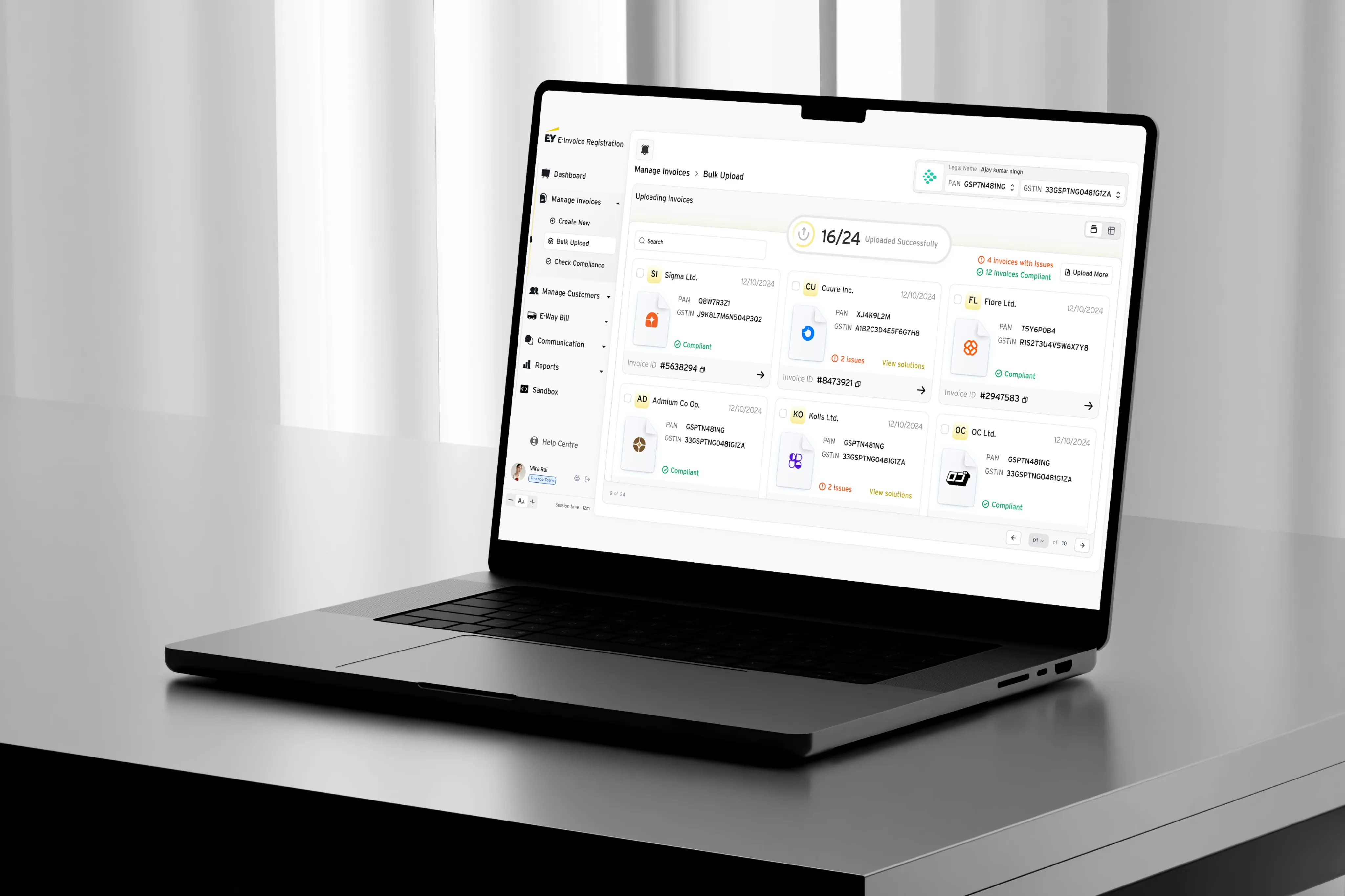
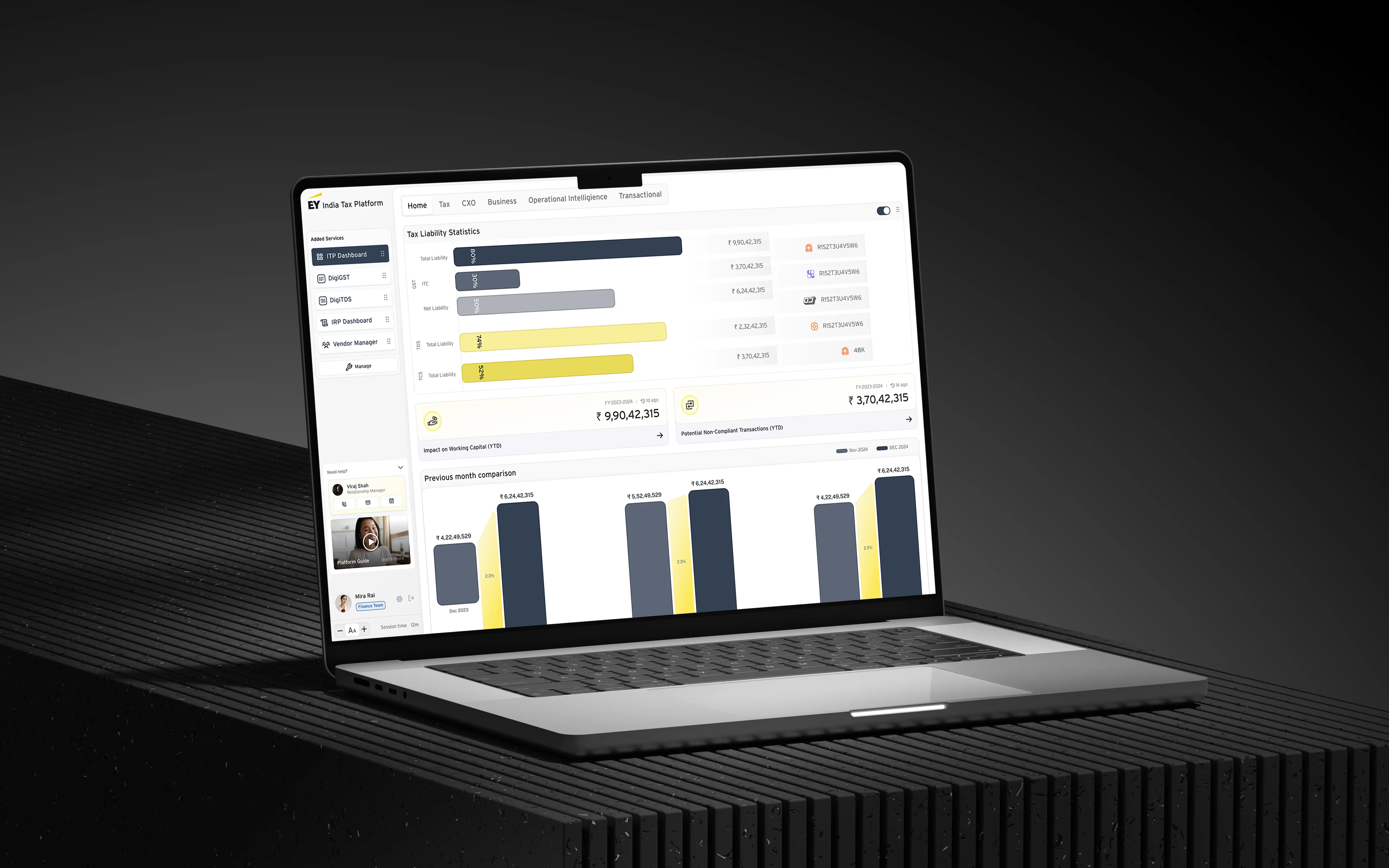
Unify four major modules — TDS, GST, Transfer Pricing, and a compliance dashboard — under a single product experience. Improve onboarding for new enterprise customers. Reduce the time existing teams spent moving between modules during the closing week of every quarter.

On paper, a redesign. In practice, a question about what the product was for.

EY India — Compliance dashboard
EY India — Invoice upload calendar
03 / The approach
i. Start with the workflow

We started with a tax person, not a designer. We mapped how an enterprise tax team actually works through a quarter. What they reconcile, what they file, where the pressure points sit during the closing week, which numbers they double-check and why.

From that we drew the spine the product should have had. A single timeline of obligations. A single ledger of reconciliations. A single notification system. The information architecture was the design.

ii. Make it visible, fast

Once the spine was agreed, we moved into prototype quickly. The Two Words Co-Pilot generated the first three frames of every key surface inside their existing design tokens. We iterated on those rather than on slides.

Stakeholders argued with screens, not with strategy decks. That changed the speed at which decisions stuck.

EY India — Tax platform overview
iii. Redraw the screens

The visual system came last because it had the easiest job. By the time we touched components and layouts, the information architecture was already doing the heavy lifting. The interface only had to stay out of the way.

04 / In the work
EY India — GST workflow detail
EY India — Reconciliation ledger
05 / The outcome
i. What changed

The platform now reads as a single product. The four modules that used to feel like four are still there, but the user moves between them through a shared spine. Onboarding for new enterprise customers is shorter. Closing weeks feel less like firefighting and more like routine.

The work continues. We are now the design and engineering partner for the next two product lines on the platform.

4 1
Modules unified
under a single spine
~40%
Reduction in time
moving between modules
2
New product lines
now in our scope
— Start here

Some of our best projects
started with a two-line email.

Send yours